Back to Branding
Branding + Print
The Print House
A loud local print identity built for the counter, the sidewalk, the street, and the feed.
The kind of brand that should make someone stop mid-walk and go, "Wait, they do wraps too?"
- Role
- Brand Identity / Print Design / Campaign Assets
- World
- Counter / Sidewalk / Street / Feed
- Scope
- Logo System / Visual Language / Print Collateral / Vehicle Graphics / Social
Strategy
Built to get noticed. Then remembered.
Print shops live in the real world.People see them from cracked parking lots, moving cars, storefront windows, and Instagram posts they barely meant to stop on. So the identity could not be precious. It had to be loud, fast, and useful.
Not loud for the sake of being loud. Loud because attention is the first job.
Problem
A shop built to be seen.
The Print House needed more than a logo slapped on a few things and called a day. It had to survive glare, vehicle panels, tiny cards, social crops, and whatever else a local print shop has to throw its name on by Friday.Audience
Local buyers. Fast decisions.
This was built for business owners, contractors, creators, and walk-in customers who need their stuff printed without feeling like they walked into a beige copy center from 2009.01 / Identity
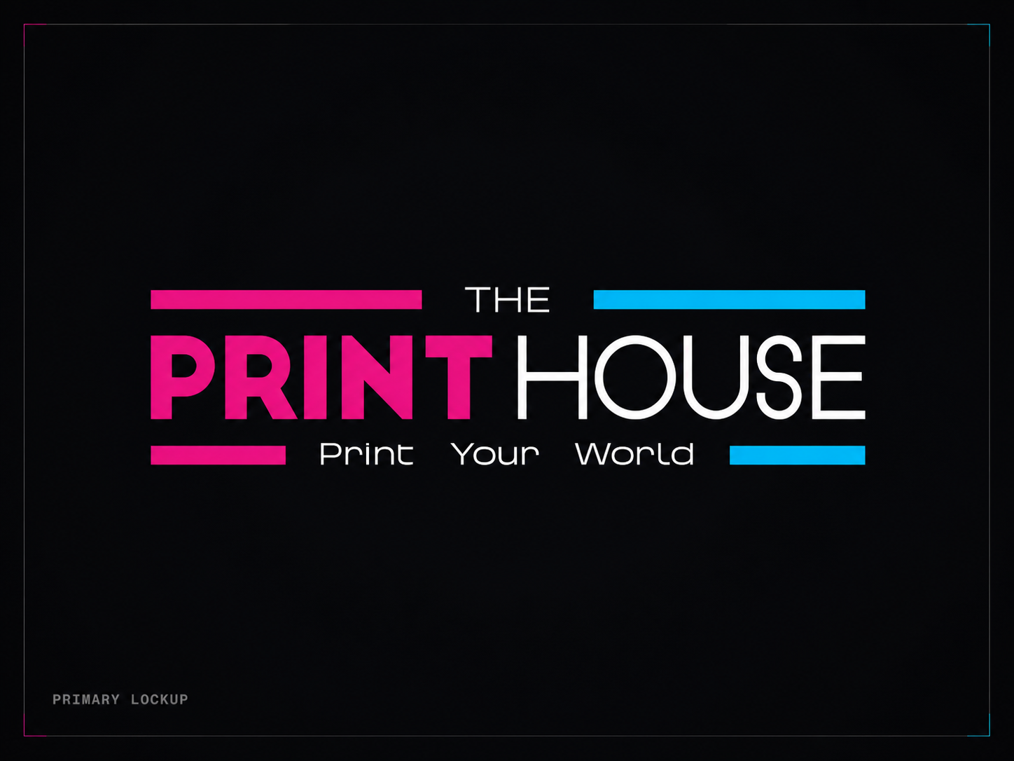
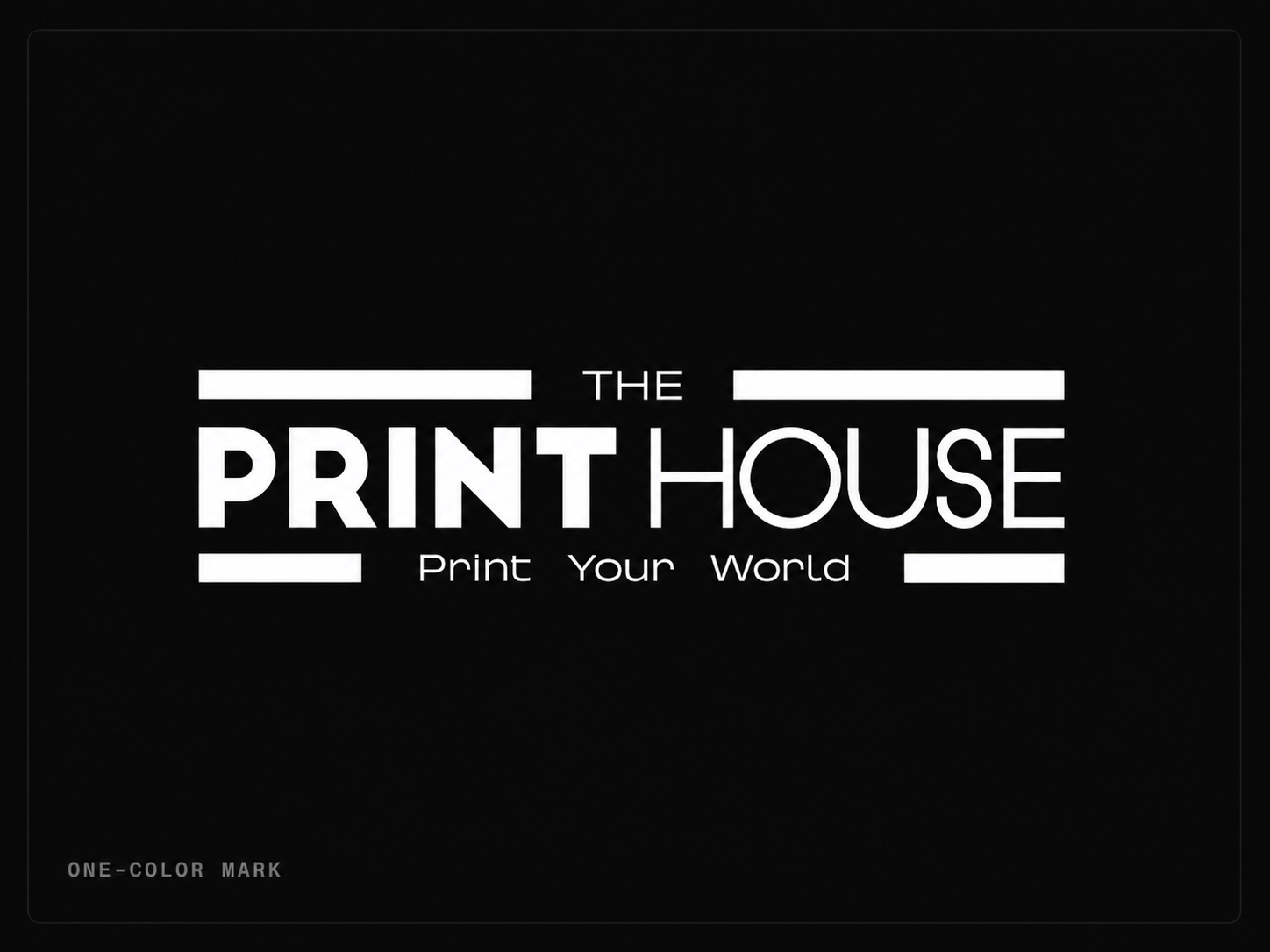
A mark that can hold its own.
The logo had to be simple enough to recognize fast, but strong enough to sit inside a visual system that is basically yelling in cyan and magenta.
Make the mark clean. Let the world around it get loud.
Make the mark clean. Let the world around it get loud.
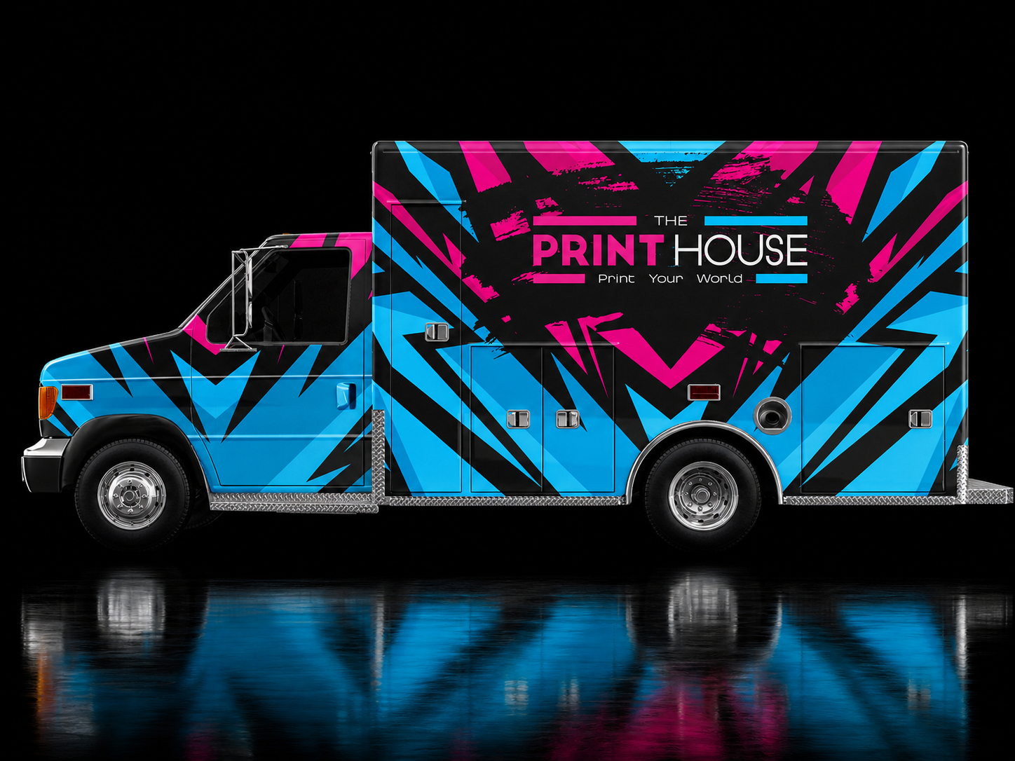
02 / Visual System
It had to move before it talked.
A print shop does not always get a calm, perfectly framed introduction. Sometimes someone sees the truck for two seconds at a red light.
The cyan and magenta do the screaming. The black keeps it from turning into a carnival.
The cyan and magenta do the screaming. The black keeps it from turning into a carnival.


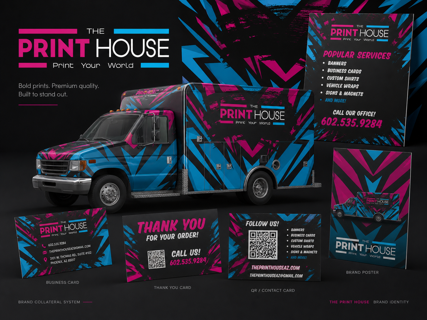
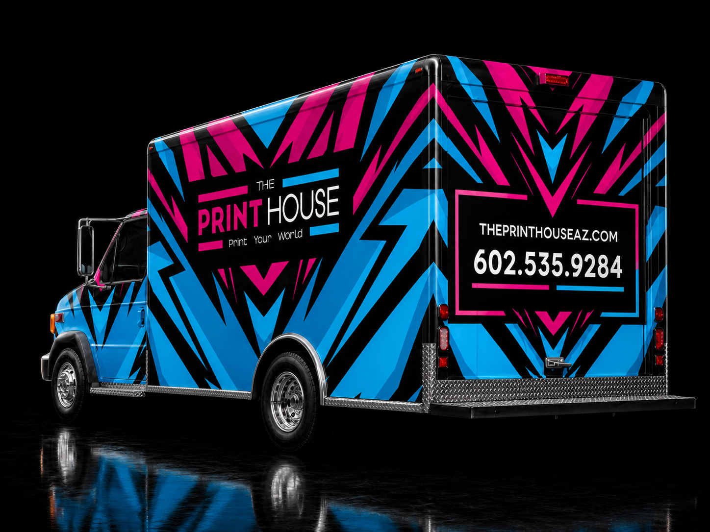
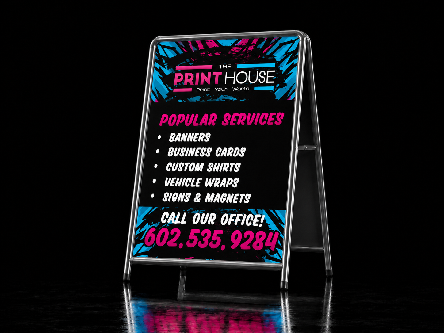
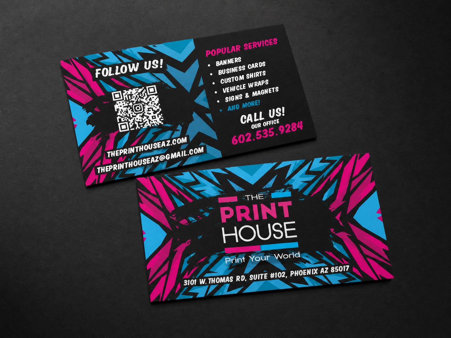
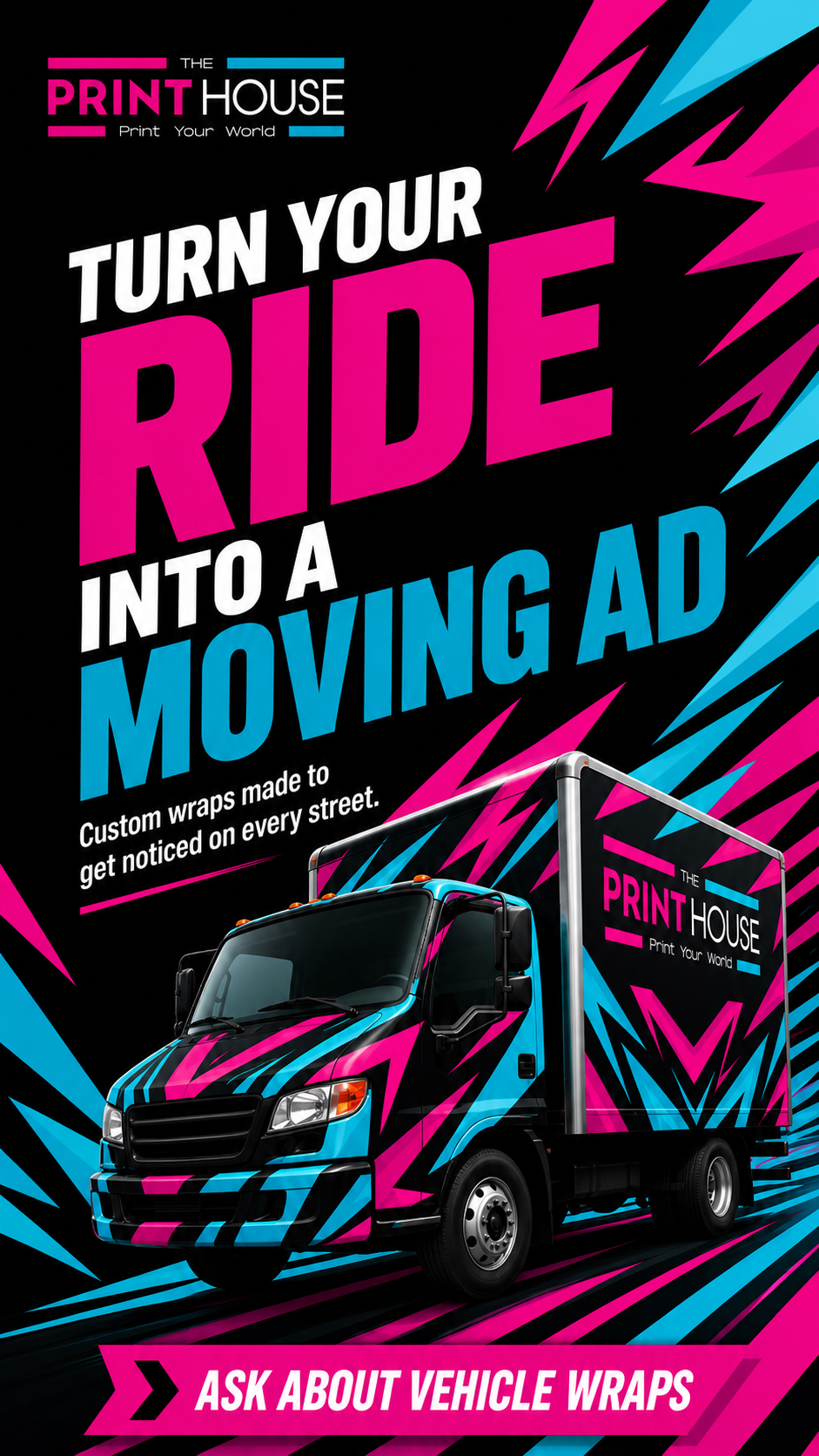
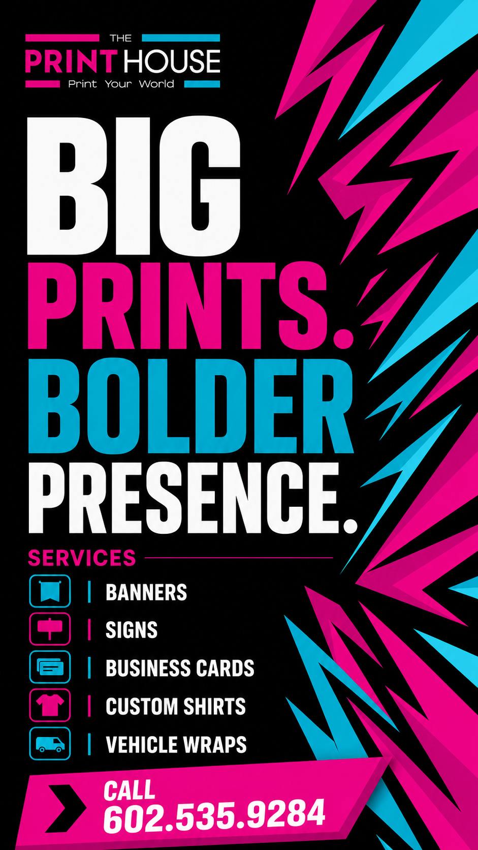
03 / Print + Environment
Built for the places people actually see it.
This brand was not made to live only in a perfect square on a portfolio page.
It had to work on a storefront. On a truck. On a business card. On a sticker. On a sign sitting outside trying to win a stranger's attention.
That is where the system either holds up or falls apart.
It had to work on a storefront. On a truck. On a business card. On a sticker. On a sign sitting outside trying to win a stranger's attention.
That is where the system either holds up or falls apart.

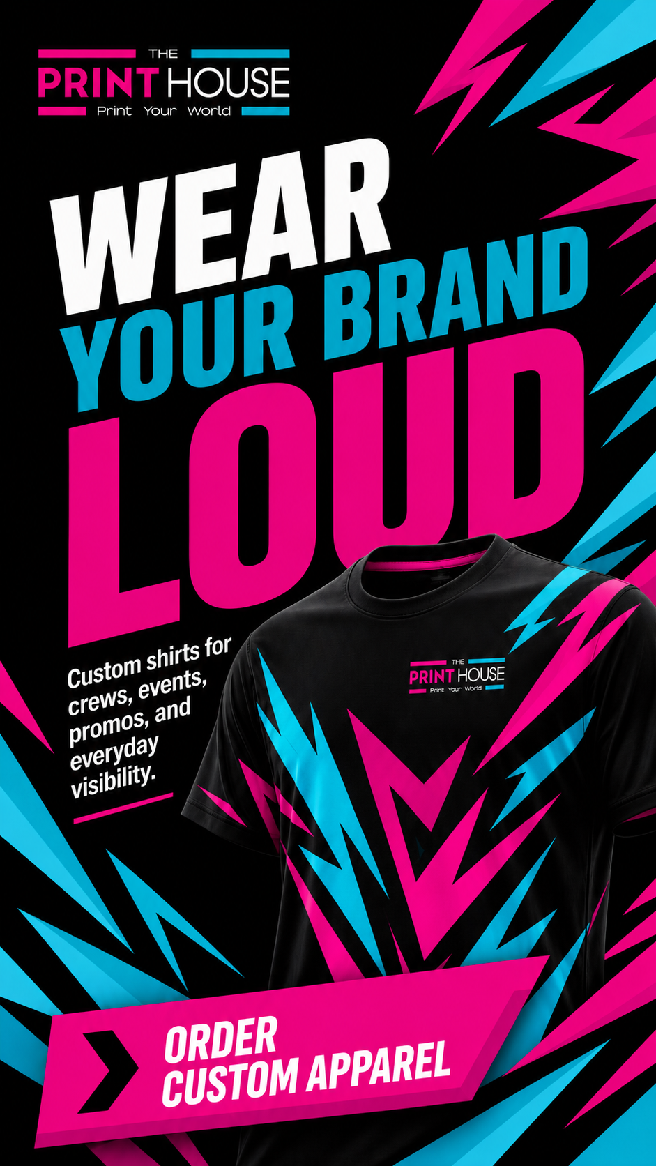
04 / Social
Loud enough for the feed.
The social pieces had to feel like the same shop, not a separate campaign wearing the brand as a costume.
Same colors. Same motion. Same attitude. Different messages.
Quick reads. Big type. No whispering.
Same colors. Same motion. Same attitude. Different messages.
Quick reads. Big type. No whispering.
Final Read
One system. A lot of surfaces.
The Print House needed to feel built, not pieced together.
The final system can stretch from a truck wrap to a storefront window, from a package sticker to a social post, and still feel like the same brand walked into the room.
Loud, yes.
Useful, also yes.
That was the point.